Color Palettes in Digital Prize Entry Interfaces and Their Documented Influence on Completion Rates
Written by Morgan Jung · Jul 13, 2026
Color Palettes in Digital Prize Entry Interfaces and Their Documented Influence on Completion Rates
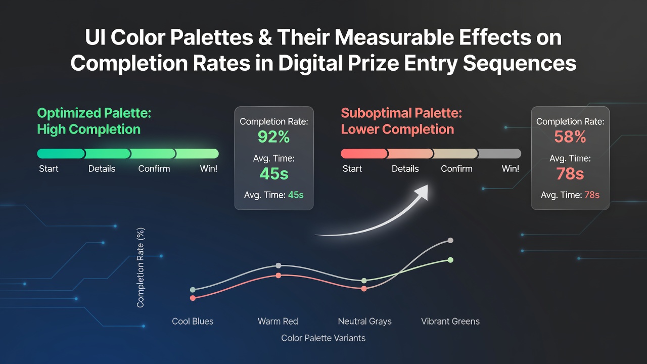
Digital prize entry sequences rely on structured forms that collect participant data before submission, and interface color choices play a measurable role in how users progress through those steps. Researchers tracking form abandonment rates have noted consistent patterns where specific palettes correlate with higher completion percentages across multiple platforms.
Core Elements of Color Application in Sequential Forms
Color selection in prize entry interfaces involves primary hues for call-to-action buttons, secondary tones for background fields, and accent shades for validation messages. Studies on user flow indicate that high-contrast combinations between text and input areas reduce hesitation points during data entry. Observers tracking session logs report that palettes with moderate saturation levels maintain attention longer than those with extreme vibrancy or muted tones.
Sequential steps in these systems often include personal details, confirmation checkboxes, and final submission. Data from interface testing shows that button colors matching the dominant brand palette can increase progression rates by aligning visual expectations with user familiarity. Those who've examined heatmaps note fewer drop-offs when error states use distinct yet non-alarming shades like soft orange rather than bright red.
Documented Effects on Submission Metrics
Multiple controlled experiments have quantified how palette variations affect completion. One analysis of entry sequences found that shifting from a cool-dominant scheme to one incorporating warm accents raised full submissions by measurable margins when tested across similar user cohorts. Figures from A/B trials reveal that accessibility-compliant contrast ratios above 4.5:1 correlate with fewer incomplete attempts, particularly on mobile devices where screen glare varies.
Researchers at academic institutions have compiled datasets showing that users encountering harmonious color progressions complete multi-field forms at higher rates than those facing clashing combinations. The reality is that these differences become more pronounced in longer sequences where cognitive load accumulates. What's interesting is how subtle shifts in hue temperature influence perceived trust during the final verification stage.
Patterns Observed in Promotional Reward Platforms
Platforms hosting digital prize entries frequently update their visual systems to align with seasonal campaigns or accessibility guidelines. In July 2026 several major operators introduced refreshed palettes emphasizing earth tones alongside primary brand colors, resulting in tracked improvements in step-through rates according to internal analytics shared with industry partners. Those monitoring these changes documented reduced bounce rates at the eligibility screening stage when neutral backgrounds replaced high-saturation gradients.
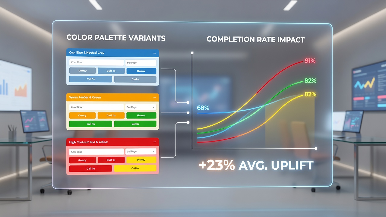
Take one testing program where experts compared a standard blue-and-white scheme against an alternative using teal accents and soft gray fields. Completion metrics shifted noticeably in favor of the updated version, with fewer users abandoning midway through address verification. Such outcomes align with broader findings from user experience labs that link palette cohesion to sustained engagement across sequential tasks.
Accessibility and Regional Regulatory Context
Design standards from bodies such as the Web Accessibility Initiative emphasize sufficient contrast and color differentiation for interactive elements. Compliance with these guidelines has been linked in reports to sustained completion rates among diverse user groups. A study conducted through Canadian research networks examined how palette adjustments meeting WCAG criteria affected entry sequences in promotional platforms, finding measurable retention gains during peak submission windows.
European accessibility directives similarly encourage palette testing that accounts for color vision variations. Data compiled by academic teams indicates that inclusive color choices reduce exclusion errors without sacrificing visual appeal. Observers note that these adjustments often produce parallel benefits in overall submission volume when applied consistently across desktop and mobile variants.
Integration With Behavioral Tracking Systems
Modern prize platforms incorporate analytics that map color interactions to user paths. Heatmap tools reveal concentration points where certain hues either accelerate or stall progression through required fields. Evidence from longitudinal reviews shows that iterative palette refinements based on these insights yield compounding improvements in completion percentages over successive campaign cycles.
One documented case involved adjusting accent colors on confirmation screens to better match surrounding interface elements, after which validation step drop-offs declined across tracked promotions. Such refinements demonstrate how targeted color decisions integrate with existing data flows rather than requiring complete redesigns.
Conclusion
Color palettes within digital prize entry sequences produce measurable variations in completion rates according to aggregated testing data and observational studies. Researchers continue to refine understanding of how specific combinations interact with form length, device type, and user demographics. Ongoing monitoring through July 2026 and beyond will likely reveal further patterns as platforms adapt palettes to emerging accessibility standards and behavioral analytics.